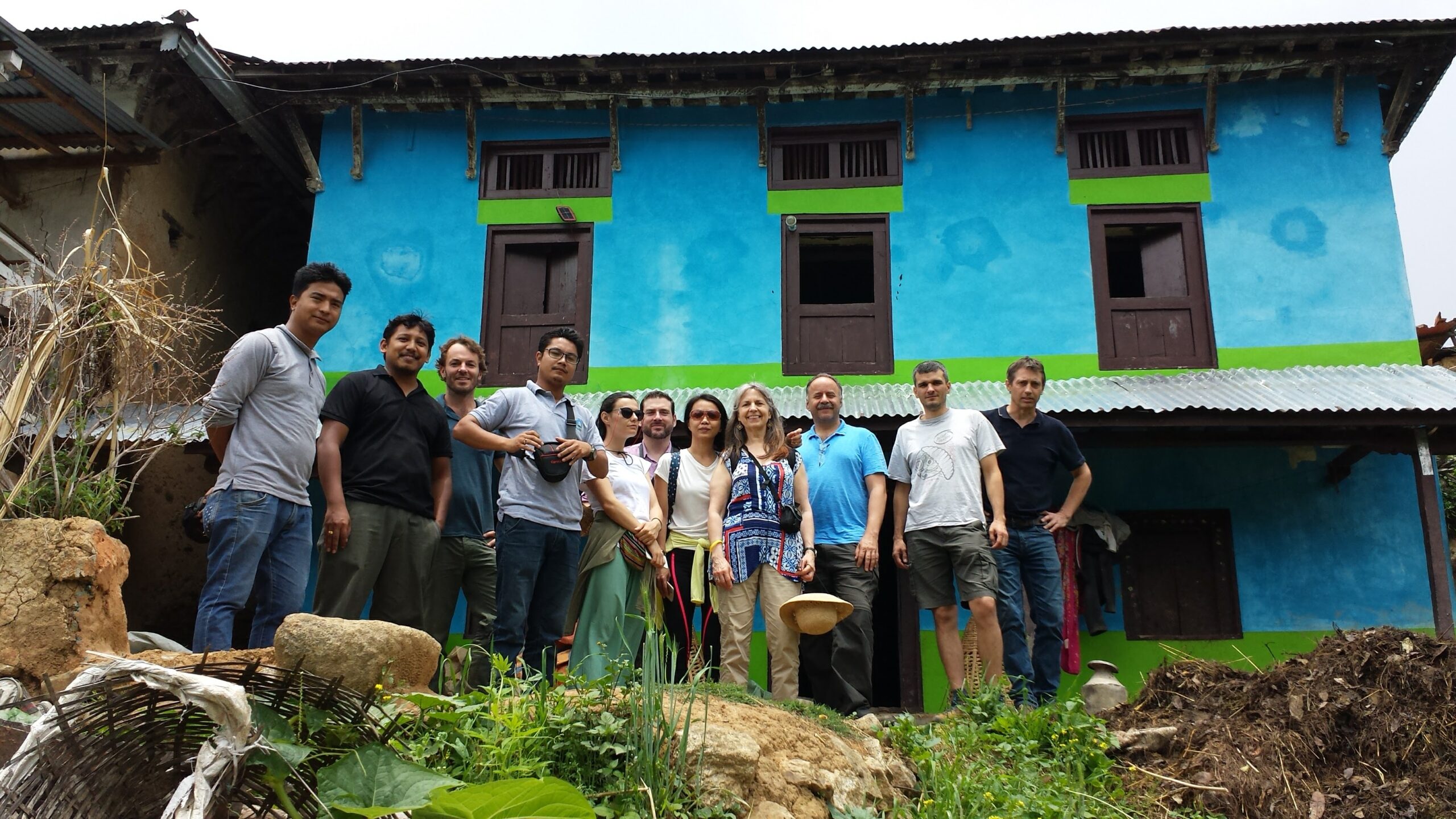
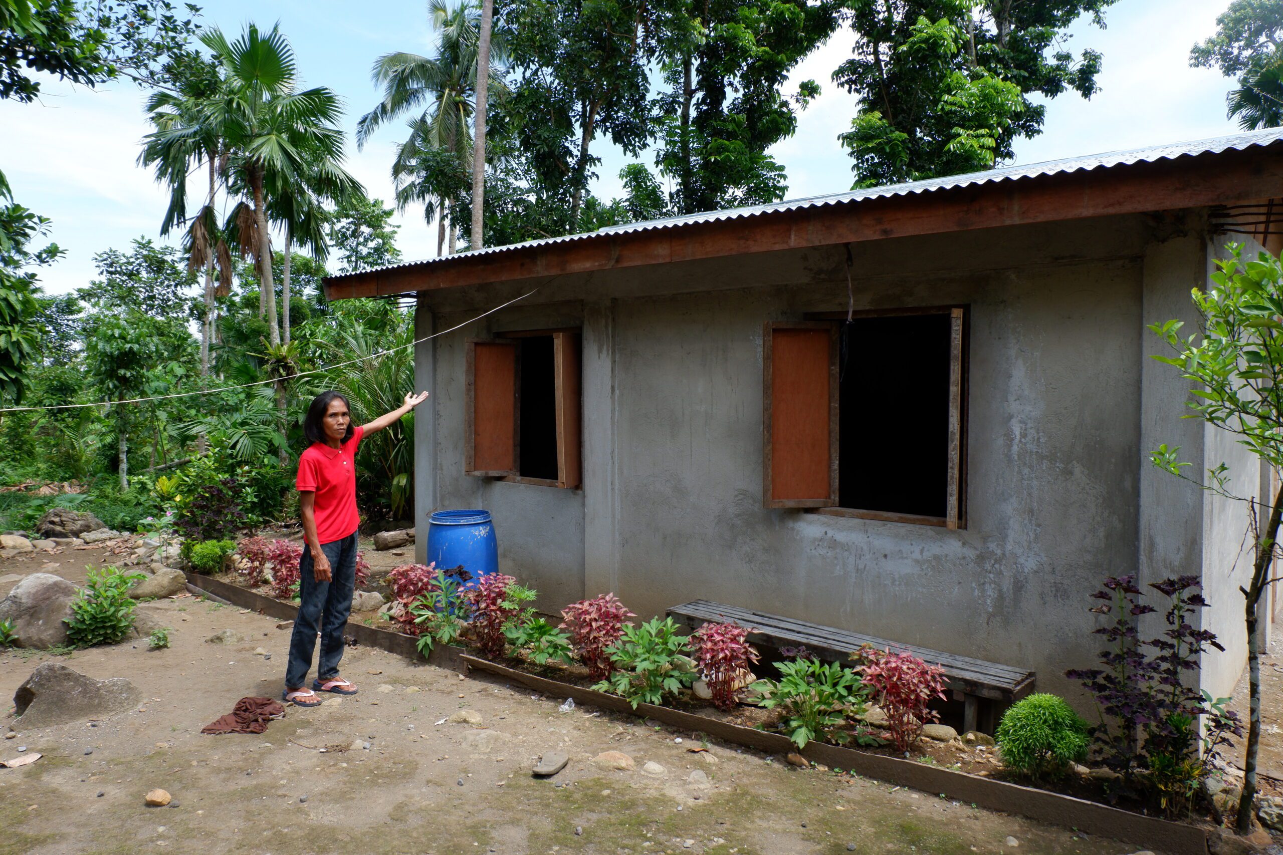
Now that we have successfully strengthened our house, I no longer worry about it. Now, I can put my attention and focus on guiding my kids through their education

_Component Page_
This page is for testing.
The purpose of this page is to display the majority of the elements and components that exist on the Build Change website. This first list includes the simple content elements that are used in the standard WordPress editor.
Heading 1
Heading 2
Heading 3
Heading 4
Heading 5
Heading 6
Lorem ipsum dolor sit amet, adipiscing elit. Nullam dignissim convallis est. Quisque aliquam. Donec faucibus. Nunc iaculis suscipit dui. Nam sit amet sem. Aliquam libero nisi, imperdiet at, tincidunt nec, gravida vehicula, nisl.
Bold text, emphasis or italic, and strikethrough. Lorem ipsum dolor sit amet. Nullam dignissim convallis est. Quisque aliquam.
This is a link and this link opens in a new window
Ordered List
- List Item 1
- List Item 2
- Subitem 1
- List Item 3
Unordered List
- List Item 1
- List Item 2
- Subitem 1
- List Item 3
Lorem superscript dolor subscript amet, consectetuer adipiscing elit.
Blockquote Egestas pretium aenean pharetra magna ac placerat.
You can also align text. The default is left aligned.
You can center align.
Or you can right align.
Buttons
Next we level up to more complex elements. Buttons! Here are the different ways you can use buttons:
- After any Content Block you can add buttons. This is a good way to create a Call to Action (CTA).
- A Button Block can be used as a visual break or when more buttons are needed. There is also a background color option
Additionally options:
- Alignment: you can change the alignment of the group: left, center, or right
- Types: are 3 types of buttons: Primary, Secondary, and Text Button
- Link Types: Buttons can use a URL (normal link) or an Anchor Link (link to a section of the page)
- Link Target: If the URL is a non Build Change link it is HIGHLY recommended to select Yes as an External Link, so a new browser window opens and the user does not leave Build Change
Below, the first row of buttons are part of the Content Block. The second are a Button Block.
Dynamic Layout
Now let’s see the different attributes with our dynamic layout.
Background Colors
There are 4 background color options: white, neutral, light blue, and light green. Typically white and neutral should be used standard content and light blue and light green used to highlight or feature content.
2 Columns
Remember, that users will be viewing on both desktop and mobile. This is important to note because the with 2 Column example the first column will be left on desktop and on top in mobile and the second column is on the right on desktop and bottom on mobile.
Types of 2 column layouts are:
- Both Content Blocks
- Media / Content
- Content / Media
- Both Media Blocks
3 Columns
Types of 3 column layouts are:
- 3 Even Columns
- 33% / 66% – which on desktop are only 2 areas of content or media divided by 3
- 66% / 33% – which on desktop are only 2 areas of content or media divided by 3
2 Column Example
Dynamic Layout
Lorem ipsum dolor sit amet, adipiscing elit. Nullam dignissim convallis est. Quisque aliquam. Donec faucibus. Nunc iaculis suscipit dui. Nam sit amet sem. Aliquam libero nisi, imperdiet at, tincidunt nec, gravida vehicula, nisl.

This is an example of a media caption
3 Columns
Lorem ipsum dolor sit amet, adipiscing elit. Nullam dignissim convallis est. Quisque aliquam.
Second Column.
Lorem ipsum dolor sit amet, adipiscing elit. Nullam dignissim convallis est. Quisque aliquam.
Third Column.
Lorem ipsum dolor sit amet, adipiscing elit. Nullam dignissim convallis est. Quisque aliquam.
Neutral Color Background
Lorem ipsum dolor sit amet, consectetur adipiscing elit, sed do eiusmod tempor incididunt ut labore et dolore magna aliqua. A lacus vestibulum sed arcu non. Iaculis urna id volutpat lacus laoreet non. Tortor dignissim convallis aenean et tortor at risus viverra. Ut aliquam purus sit amet luctus venenatis.
Light Blue Color Background
Lorem ipsum dolor sit amet, consectetur adipiscing elit, sed do eiusmod tempor incididunt ut labore et dolore magna aliqua. A lacus vestibulum sed arcu non. Iaculis urna id volutpat lacus laoreet non. Tortor dignissim convallis aenean et tortor at risus viverra. Ut aliquam purus sit amet luctus venenatis.
Light Green Background
Lorem ipsum dolor sit amet, consectetur adipiscing elit, sed do eiusmod tempor incididunt ut labore et dolore magna aliqua. A lacus vestibulum sed arcu non. Iaculis urna id volutpat lacus laoreet non. Tortor dignissim convallis aenean et tortor at risus viverra. Ut aliquam purus sit amet luctus venenatis.
Accordions
An accordion is an interactive component that allows users to expand and collapse sections of content. It helps streamline large amounts of information into manageable, collapsible panels, improving user navigation, reducing the overall length of a page on mobile, and enhancing the overall browsing experience.
Accordion Block
At the desktop screen size, the Accordion Block looks like a simple box with a defined heading and body content area, but on mobile, it only displays the heading and the first 2 lines of text. Read More is the default text to show the rest of the content but the button text can be customized.
- Possible use cases: highlighting introductory text or details that allow users to access specific details as needed
Accordion Component Example
Lorem ipsum dolor sit amet, consectetur adipiscing elit, sed do eiusmod tempor incididunt ut labore et dolore magna aliqua. A lacus vestibulum sed arcu non. Iaculis urna id volutpat lacus laoreet non. Tortor dignissim convallis aenean et tortor at risus viverra. Ut aliquam purus sit amet luctus venenatis.
Lorem ipsum dolor sit amet, consectetur adipiscing elit, sed do eiusmod tempor incididunt ut labore et dolore magna aliqua. A lacus vestibulum sed arcu non. Iaculis urna id volutpat lacus laoreet non. Tortor dignissim convallis aenean et tortor at risus viverra. Ut aliquam purus sit amet luctus venenatis.
Accordion Group
This is the most common accordion component and a basic use case is an frequently asked question (FAQ). For example, users can click on a question to reveal the answer, allowing for easy access to relevant information without overwhelming the page with text.
Attributes include:
- Section Heading: this is not mandatory
- Each accordion has a:
- Heading
- Content Block
Accordion Group Component
Card Components
A card component is a versatile component that displays content in a compact, structured format. It typically contains an image, title, description, and a call-to-action, providing a quick overview and easy access to more detailed information. Cards are used to group related content and make browsing more intuitive and visually appealing.
There are multiple types of card components that can be used on the Build Change website and each type will be explained below.
Standard Card Group
The Standard Card Group type is the most common group. It does not include any extra branding or features and is a simple way to highlight related content like Build Change Resources or external resources – any external resources should open in a new window.
The attributes for each card include:
- Image: this is not required but highly recommended to provide visual interest
- Overline: an overline, or eyebrow text, is a brief, upper-level label used above a headline or title to provide context or categorize content on a website
- Title
- Supporting Text
- Link Type: this controls whether clicking on the card opens the destination link in the same or new tab. If it is a non Build Change link, it should open in a new tab
- Card URL: this is the destination link
Standard (Portrait) Card Block
Stacked Card Group
The Stacked Card Group is similar in content to the Standard Card Group but provides an additional layer of Build Change branding to the cards.
The attributes for each card include:
- Card Color: the options include Timid Magenta, Timid Green, Timid Orange, and White
- Image: this is not required but highly recommended to provide visual interest
- Overline: an overline, or eyebrow text, is a brief, upper-level label used above a headline or title to provide context or categorize content on a website
- Title
- Supporting Text
- Link Type: this controls whether clicking on the card opens the destination link in the same or new tab. If it is a non Build Change link, it should open in a new tab
- Card URL: this is the destination link
Action Card Group
The purpose of the Action Card Group is to provide content that encourages a user to take an action. This does provide an additional layer of Build Change branding to the cards, if needed.
The attributes for each card include:
- Action Card Color: the options include Deep Blue, Deep Green, White, and the Climate Resilient Housing gradient
- Content Block: a flexible area to add an image and text. This should be short and concise
- Button Text: this text should give the user a short call-to-action
- Link Type: this controls whether clicking on the card opens the destination link in the same or new tab. If it is a non Build Change link, it should open in a new tab
- Card URL: this is the destination link
Flip Card Group
The purpose of the Flip Card Group is to provide visual interest and provide additional content on the opposite side of the card. The user reveals the content by clicking/tapping on the card.
The attributes for each card include:
- Image: this is not required but highly recommended to provide visual interest
- Overline: an overline, or eyebrow text, is a brief, upper-level label used above a headline or title to provide context or categorize content on a website
- Title
- Content Block: a flexible area to add an image and text. This should be short and concise
- Button Text: this text should give the user a short call-to-action
- Link Type: this controls whether clicking on the card opens the destination link in the same or new tab. If it is a non Build Change link, it should open in a new tab
- Card URL: this is the destination link
Flip Card Type Block
Content above
- item 1
- item 2
- item 3
Content below

Content above
- item 1
- item 2
- item 3
Content below
Content above
- item 1
- item 2
- item 3
Content below
Impact Card Group
The Impact Card Group is a Build Change branded card that calls specific Impact categories to the user’s attention. The user reveals additional content by clicking/tapping on the card.
The attributes for each card include:
- Impact Type: select the type of Impact category that will be used. This is based on our Impact Indicators.
- Image: it is not recommended to use this option because the Impact Indicator icon will be used by default, but if a specific image is preferred you have the option to use it
- Content Block: a flexible area to add an image and text. This should be short and concise
Safety, Resilience & Health
Content above
- item 1
- item 2
- item 3
Content below
Gender Equity & Proximity
Content above
- item 1
- item 2
- item 3
Content below
Climate Sustainability
Content above
- item 1
- item 2
- item 3
Content below
Testimonial Component
The Build Change Testimonial Component showcases a quote or quotes from Stakeholders, adding credibility and trust by highlighting positive experiences. The most dynamic feature of the Testimonial Component is it pulls the quote from a single source of truth ensuring the quote is correctly referenced across the website.
There are two types of Testimonial Component – Single or Multiple – with several attributes that manipulate the layout. Before using a Testimonial, the following steps must be followed:
- The Stakeholder who has given consent to be quoted must be added to the Testimonials content type. IMPORTANT: search if the stakeholder already exists before adding a new one. A Stakeholder can have multiple quotes
- If the Stakeholder already exists, add a new quote and remember the quote number. If the Stakeholder does not exists add a new testimonial with the required fields which includes at least one quote
The Stakeholder name and quote number will be referenced in the Testimonial Components.
Testimonial Attributes
It is important to note the different Testimonial attributes for each Stakeholder.
- Context: the visible line under the stakeholder’s name which is consistent across all quotes for this stakeholder across the website
- Author Image: this is a small thumbnail photo of the stakeholder and should be cropped
- Quotes: multiple quotes are allowed and encouraged
- Quote: limited to 300 characters and no formatting is allowed (bold, italic, links, etc)
- Image: not required but an image can be included to allow to highlight the individual or context of the quote. This should not be the same as the author image
- Video: not required but a great way to bring the quote to life. The video must be hosted on YouTube and is recommended to be hosted via the Build Change YouTube account to ensure we can control it
- Testimonial Type: these are additional types and not mandatory
- Before & After: more info below
- Story: if this attribute is selected, a Long Form Story must be included (info below). This Story will be then automatically listed on the Stories page
- Before & After Attributes: each Stakeholder has the option to include a single Before & After example to demonstrate the state of the building before and after the intervention. A before photo is not mandatory. The layout options include:
- Split View: this will display the before & after images
- After & Quote: this will only display the after image and an additional quote
- After & Video: this will only display the after image and a YouTube video
- Before/After & Video: this will display the before image, after image, and a YouTube video
- Long Form Story: this is a content block to add the Stakeholder’s story. In addition to the story, a Feature Image should be added to the Stakeholder content type and the Locations List should have the correct location selected to display the Stakeholder on the Stories page
Testimonial (Single)
The attributes for each testimonial include:
- Stakeholder Name: if you cannot find the stakeholder name see the steps above and make sure the stakeholder is published
- Single Testimonial Type: there are two dynamic layout types – Single Quote and Before & After. See the Stakeholder attributes above to understand the different parts that can be used in the layout
- Single Quote attributes:
- Color: this attributes controls the color of the quote and borders if they exist
- Borders: option to show or hide borders
- Quote Number: this quote number will be used
- Quote Layout Options:
- Text Only: this will only display the quote
- 50/50: on desktop, this will provide an even split between the quote and selected media type
- 2/3 Quote: on desktop, this will provide 2/3 of the space to the quote and 1/3 to the selected media type
- 1/3 Quote: on desktop, this will provide 1/3 of the space to the quote and 2/3 to the selected media type
Examples
Below are several different examples of these attributes and layout options in use.

Now that we have successfully strengthened our house, I no longer worry about it. Now, I can put my attention and focus on guiding my kids through their education
Now that we have successfully strengthened our house, I no longer worry about it. Now, I can put my attention and focus on guiding my kids through their education
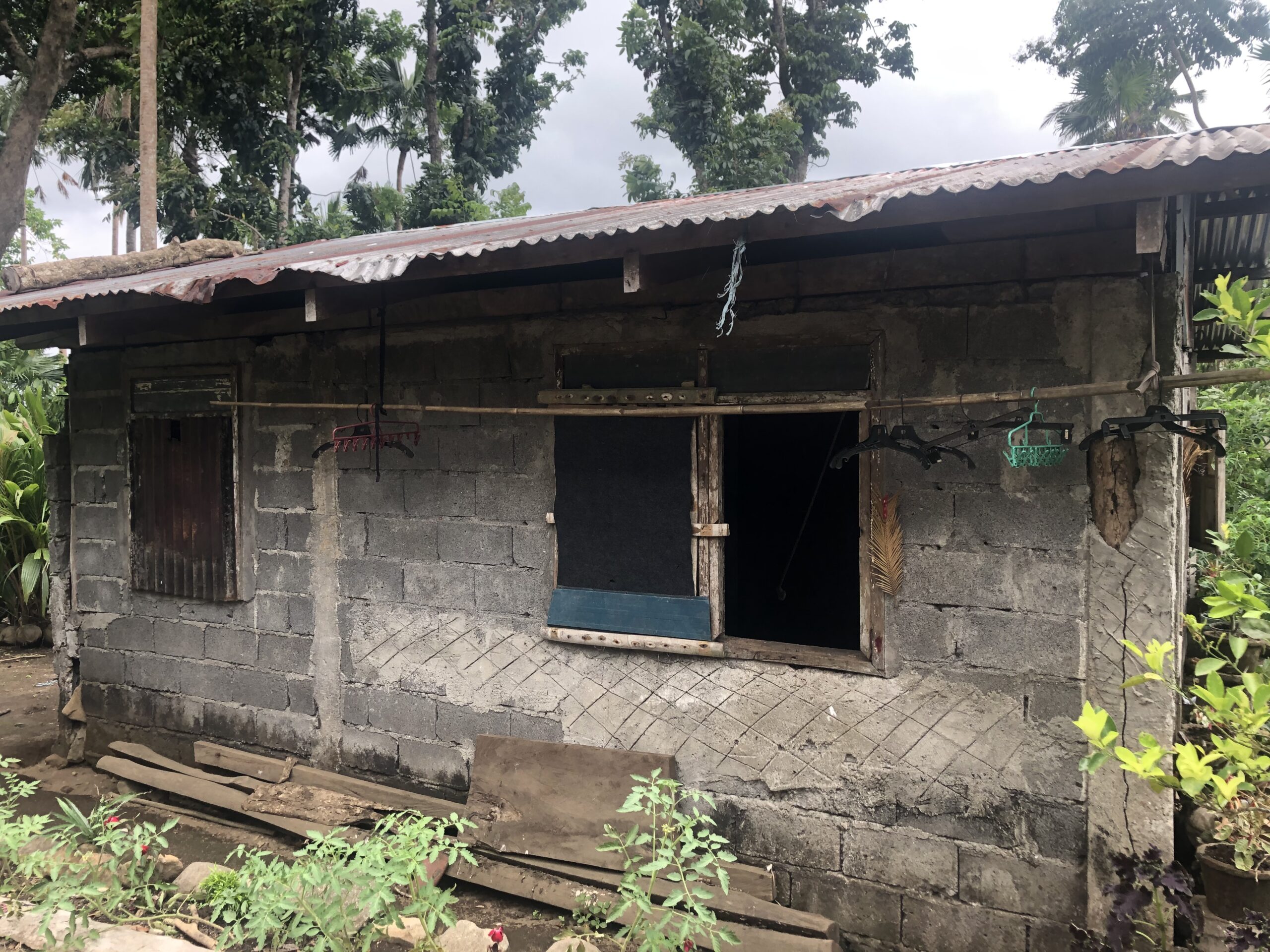
Josefina Hagosojos
Homeowner and Mom
BEFORE

AFTER

Testimonial (Multiple)
The Testimonial (Multiple) component allows for multiple Stakeholder quotes to be included. A good use case is to display multiple quotes for a country/location page or content related to a specific project. The attributes for this component include:
- Testimonial Type: this controls the layout type:
- Block Quotes: this displays the quotes in a simple branded layout
- Cards: this displays the quotes as cards
- Color: this attributes controls the color of the quote and borders if they exist
- Borders: option to show or hide borders
- Testimonials:
- Stakeholder Name: if you cannot find the stakeholder name see the steps above and make sure the stakeholder is published
- Quote Number: this quote number will be used
- Quote Width: the space for this component is divided into 3 columns, so a quote and use either single or two columns
- Select Media Type: an image can be included, if an image exists for that quote number
Testimonials
It's a great experience for me to see that I can make good blocks...it's not just the big manufacturers that can, but the small ones, too.
Now that we have successfully strengthened our house, I no longer worry about it. Now, I can put my attention and focus on guiding my kids through their education
We are substantially retrofitting existing one story homes and expanding part of them to a second story, to create a safe refuge where people can wait until the water levels subside...
Map Component
The Map Component is a layout option to display a map of one of our predefined countries along with other attributes:
- Section Heading
- Sub Heading
- Country Select
- Disaster Details:
- Disaster Type: selecting one of the defined types will display the related icon
- Description: area for a short non-formatted text
- Disaster Date
Location Impact Component
The Location Impact Component is a layout option to display the Impact Metrics of one of our predefined countries. This is a dynamic and will pull updated numbers when available.
Impact
Data is current as of March 31, 2025.
Donate Components
A Donate Component is a critical call-to-action for users that intend to donate to Build Change. There are two main options – Donate Call to Action and Donate Form.
Donate Call to Action
The Donate Call to Action has 3 different layout options. The first is standard and not editable to deliver a consistent call-to-action.
Support resilient housing worldwide
Join us in preventing housing loss caused by disasters.
Donate nowDonate Call to Action
The second layout option is a condensed call-to-action and not editable.
Donate Call to Action
The third layout option is a condensed layout and can be edited to deliver a custom call-to-action.
Custom Donate Call to Action
Donate Form
This provides an on-page option for users to use the donate form. Typically it is best to direct users to the Build Change Donate page. However, if the page has a specific and immediate call for donations this can be used.
Donate Form Component
This text can be customized for the Donate Form Component
Footer
All content types that use the Build Change Page Builder, use a customizable footer. This manages the most important opportunities to convert a regular website visiter to an engaged user. It anchors the page and fulfills the purpose of having a public website.
Donate Call-to-Action (CTA)
This Donate CTA is the same type of component described above. The options include:
- Standard
- Condensed
- Custom: the call to action text can be customized
- Hidden
Newsletter Call-to-Action (CTA)
The Newsletter CTA can either be displayed or hidden. When a user enters their email they are added to our general email list.
Support resilient housing worldwide
Join us in preventing housing loss caused by disasters.
Donate nowNewsletter
Sign up for our newsletter to receive updates on our latest news, events, and more.
